Tuesday 16 February 2010

New Campaign: Louise Redknapp for Triumph

In 2007, Triumph unveiled Louise Redknapp to be the new face of the company. She is a favorable choice due to her popularity with the public, a 32 year old mother with a great but healthy figure.
These are some of the advertising campaigns modelled by Louise:


I think that these most recent photographs for Triumph have reinvented a new image for the company, with a more classy and mature feel. Louise Redknapp was a clever choice of model, as she is loved by the public by her face and down to earth personality.
Although i do like these campaign shots, and think they work much better than the earlier campaigns for Triumph, but i think that they would seem a bit too 'mature' and 'boring' for LOVE magazine, which is aimed at the older teenage audience.

I think that we should maintain the classy feel to the campaign, but add a playful element like the previous campaigns, maybe using a male model aswell as i think they worked well.
Hopefully, combining these ideas we will come out with a clever and suitable campaign for Triumph to be published in LOVE magazine.


Triumph

Triumph is one of the leading underwear producers in the world that was founded in 1886. For our assignment, we have to produce a series of advertising campaign photographs for Triumph for potential publication in LOVE magazine.
In order to come up with some ideas, i looked at Triumph's previous advertising campaign photoshoots in order to get some inspiration.


Firstly, I looked at some of Triumph's old campagins shoots. I thought they were quite tacky, and didn't show off the lingerie to their best ability. I am not surprised that they underwent a change in terms of models and campaign style in their most recent campaigns. However, even though I think they are slightly tacky, i also think some of them are quite humorous. The humorous ones aren't too bad, but the tacky ones do nothing for the company, almost making the company look cheap, with a low advertising budget.


Example of a humorous campaign:


Example of a tacky campaign:

I think that the campaigns with the female model shot with a male work well. I think they seem more sophisticated yet playful, adding a narrative to the image. The women in the photographs hold an element of power in the Triumph lingerie. They seem to be the ones in charge, not the male.


LOVE Magazine

LOVE magazine is a new glossy fashion magazine from Conde Nast, and edited by Katie Grand, on its third issue. The photography throughout the magazine is the strongest photography i've seen in a mainstream magazine, even Vogue. It's a magazine driven by the strength of the photography, with photographers such as Mert & Marcus shooting covers and editorials. LOVE magazine is a fashion magazine, but it is more about personal style. I would describe it as a more 'down to earth' fashion magazine. It's edgy, with a lot of personality.


Issue One
The first issue was a brave move, using plus-size Beth Ditto on the front cover, which is a rarity to see models above a size 6 gracing the front cover of a glossy fashion magazine. It is bold, raw, brave and exciting to see this change, especially as a launching first cover.

"Everything about the way that Beth looks reminds us not of her imperfections but our own. She has self-assurance and confidence by the truckload. She is happy with who she is and the way she is. Don't we all wish that we woke up in the morning and felt like that?"
"Everything has been botoxed, lifted, sucked and dyed out of the women that represent the absolute aspiration of real women," - Katie Grand (editor and launcher of LOVE)

Issue Two


Issue Three


The LOVE Thing from LOVE on Vimeo.

Saturday 13 February 2010

Fashion Photoshoot: Brand campaign for a fashion magazine

Project Four:
Fashion photoshoots for a brand
campaign for a fashion magazine

In Project 4 you must work within a team and attend the meetings and creatively contribute to the team output. Although it is your individual work that will assessed at the end of term 2, the individuals work can be greatly enhanced by the professional co-operative and collaborative nature of team work.
Background to Project 4
You are creative individuals working for a creative agency.
Your agency has been commissioned by a brand to produce a series of campaign photographs for potential publication in a magazine.
Your Team brief is to produce an extensive range of Fashion photographs for a new product campaign for your client that will be used in a magazine advertising campaign.
Individual research into fashion advertising, fashion photography, styling, the brand and its products is all essential to provide your team/agency with a realistic foundation from which to select content, produce and launch the new campaign.


My group: Group 6

Brand: Triumph
Magazine: LOVE Magazine

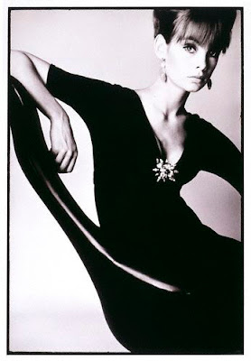
David Bailey

David Bailey is one of my favourite photographers. I love the way he captures his subjects in such a unique way than what any other photographer would. I love his work from the 60s and 70s best, as this is when Bailey was at the peak of his career in my eyes. His images were so different to any other photographer around at the time. He managed to combine a contemporary feel to his images whilst shooting them in black and white to maintain a traditional, simple feel. His subjects always seem to be relaxed and comfortable in front of him. He pays special attention to detail in his images, each one seems to be carefully thought out but still remains to maintain a simple composition.


Jane Birkin, 1969


Mick Jagger, 1964


Jean Shrimpton, 1963


Michael Caine, 1965


John Lennon and Paul McCartney, 1965


As a set: Black & White

To present my photographs as a set, i chose 5 images that i thought went well together. I chose to turn them black and white and increased the contrast of them for a more professional and traditional feel to them.


Photoshop

I manipulated the colours of some of my images on photoshop in order to experiment and enhance my images. Having had used photoshop before, I am fairly familiar with the basic and some complex uses of the program, but i am far from experienced. These are some of the subtle changes that i made some some of my images.


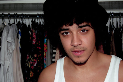
I edited the colours of this image by using the selective colour tool to enhance and degrade different colours. I increased the black in order to blend all the blacks together. like the colourful clothes in the background and the way they contrast against the subject in the foreground as he is only wearing black and white. I enhanced some of these colours so they would stand out more.

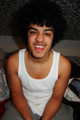
This image has a comedy feel to it so i wanted to maintain that feel. I increased the contrast and decreased the brightness to make the colours stand out and contrast more against eachother.

I thought this image was quite quirky. I desaturated the image for a more traditional feel.

To further enhance the traditional feel that the hat brings to the image, I desaturated the image, and i also increased the contrast and brightness.

With this image I desaturated it, then clicked on Variations and added red and yellow tones to the desaturated image. This formed a sepia tone.
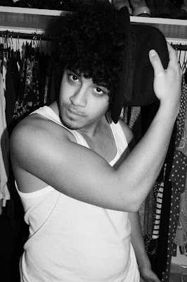
I chose the 'equaliser' setting on photoshop for the manipulation of this image.

ELLE: Peter Doherty photoshoot by Rankin

This is one of my favourite photoshoots of Pete Doherty. It was for ELLE October 2009, and shot by one of my favourite photographers; Rankin. I think Rankin captures Pete's personality and presence very well in his photographs; from the props that are used to the angles and composition. The props all represent classic Pete, from the hat, the suit, the cat and the guitar. The images are black and white, they hold a traditional feel to them. This compliments Pete's smart presence and his suit, which add a very traditional feel to the images.


"Pete's like a cat. I'm kinda moving around trying to capture him." -Rankin


Portraits: Andrew

These are some of the portrait photographs i took from my set of 20. I wanted to capture a set of relaxed images, where the subject looked comfortable and to show their personality through the images. It is often quite hard to get someone to act comfortable in front of the camera, but i thought i captured my subjects personality through my shoot. The subject in this set of images happened to be my boyfriend, so he found it easier to act himself in front of the camera as i was the photographer and the connection shows throughout my images.

I directed Andrew as my model through an informal approach, generally chatting to him throughout the whole photoshoot instead of telling him to pose in certain positions. This way, he loosened up and acted more comfortable in front on the lens as the photoshoot went on. By talking to him throughout the shoot, he was able to reflect his personality into my photographs as he felt comfortable and himself.


F-stop: f/3.8 Max Aperture: f/3.6 ISO: 400 Focal length: 20mm

F-stop: f/4.2 Max Aperture: f/4.1 ISO: 400 Focal length: 30mm

F-stop: f/4.8 Max Aperture: f/4.6 ISO: 400 Focal length: 35mm

F-stop: f/4.8 Max Aperture: f/4.6 ISO: 400 Focal length: 35mm

F-stop: f/4.5 Max Aperture: f/4.3 ISO: 400 Focal length: 31mm

F-stop: f/4.8 Max Aperture: f/4.8 ISO: 400 Focal length: 38mm

F-stop: f/4.8 Max Aperture: f/4.6 ISO: 400 Focal length: 35mm

F-stop: f/4.2 Max Aperture: f/4.0 ISO: 400 Focal length: 26mm

F-stop: f/4.2 Max Aperture: f/4.0 ISO: 400 Focal length: 26mm

F-stop: f/4.8 Max Aperture: f/4.8 ISO: 400 Focal length: 38mm

F-stop: f/4.5 Max Aperture: f/4.4 ISO: 400 Focal length: 32mm

F-stop: f/4.2 Max Aperture: f/4.1 ISO: 400 Focal length: 30mm

F-stop: f/4.2 Max Aperture: f/1.0 ISO: 400 Focal length: 28mm