Monday 14 December 2009

Final copy of my creative brief (part b)

Project 2b:

Using the information given from the Ted Baker document, i filled in my brief accordingly. I changed in some of my box headings in order to suit this information and ajusted the frame size. I also uploaded a Ted Baker logo to make the brief more personal to the company.


Final copy of my creative brief (part a)

Project 2a:

This is my final design for my creative brief. I like the simplicity of the design. "Simplicity is they key in creating a creative brief". Thus, i made my brief simple yet stylish.

Creative Brief

Project Two:
Design and Develop a Creative Brief


a) You are working for a media/ PR agency. The creative bried the agency use is out of date and requires re-styling & designing. You are asked to re-design the brief using Adobe In Design.

Your creative brief must have a brand identity for the agency. With this in mind you will creat the corporate identity and also add appropriate and considered style, colour, structure and layout to all the component parts of a brief.


b) You will choose one unformatted piece of 'live' creative briefs, copy to provide your client information.

Ted Baker or Brylcreem

You will then edit the copy, organise and present this information onto the blank brief for the agencies 'creative team' who are working on the contract.

....................................................


Creating the background design, i had to use 4 copies of the same images
in order to make it spread over the size of the document. I like the lilac/grey colour and floral pattern design for the background for my creative brief.


I wanted to make my logo simple. I named my 'company' KLAS. I used a simple box design for my logo and kept the font the same throughout the creation of my brief, font: Tw Cen MT Condensed. I like the uniqueness and simplicity of this font.

I created boxes for my information to be framed in. I want my information to be framed neatly in order to make my creative brief look professional and well presented.

I wanted to keep my design simple, but to 'jazz' it up a bit and to add to the presentation, i contrasted the box frames from thin to bold frames. This made the boxes stand out.

Final copy of my reconstructed article

Project 1b


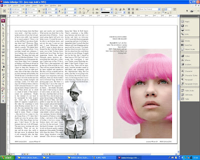
This is my final copy of my reconstructed article. The original article was 16 pages long, and i have condensed my article to 10 pages. Although i thought the original article layout and design was good, i thought 16 pages was quite long considering that it didn't contain loads of text. I didn't like the way the original article contained pages of block text, and then had about 4 or 5 pages of photographs after each other. So, for my article, i decided to page the text out in order to make it more enjoyable to read. Instead of pages of block text, I spaced it out throughout the pages, on some full page photographs i put quotes or a small amount of text, just enough not to ruin the visuals and composition of the image, but to make the text in a more accessible position.


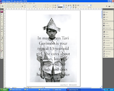
This is the cover of my article. I like the simplicity of it; the simple black and white theme and composition of the text layed over the image.

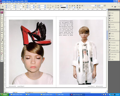
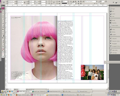
With this page spread, i integrated the image into the text in order to make the text seem more interesting to read instead of just a plain block of text with no images.

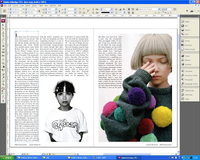
Again with this spead, i have integrated the image into the text with the page on the right-hand-side. With the image on the left, i felt that it worked best alone with no text as i thought the text distracted the central compostion of this image.

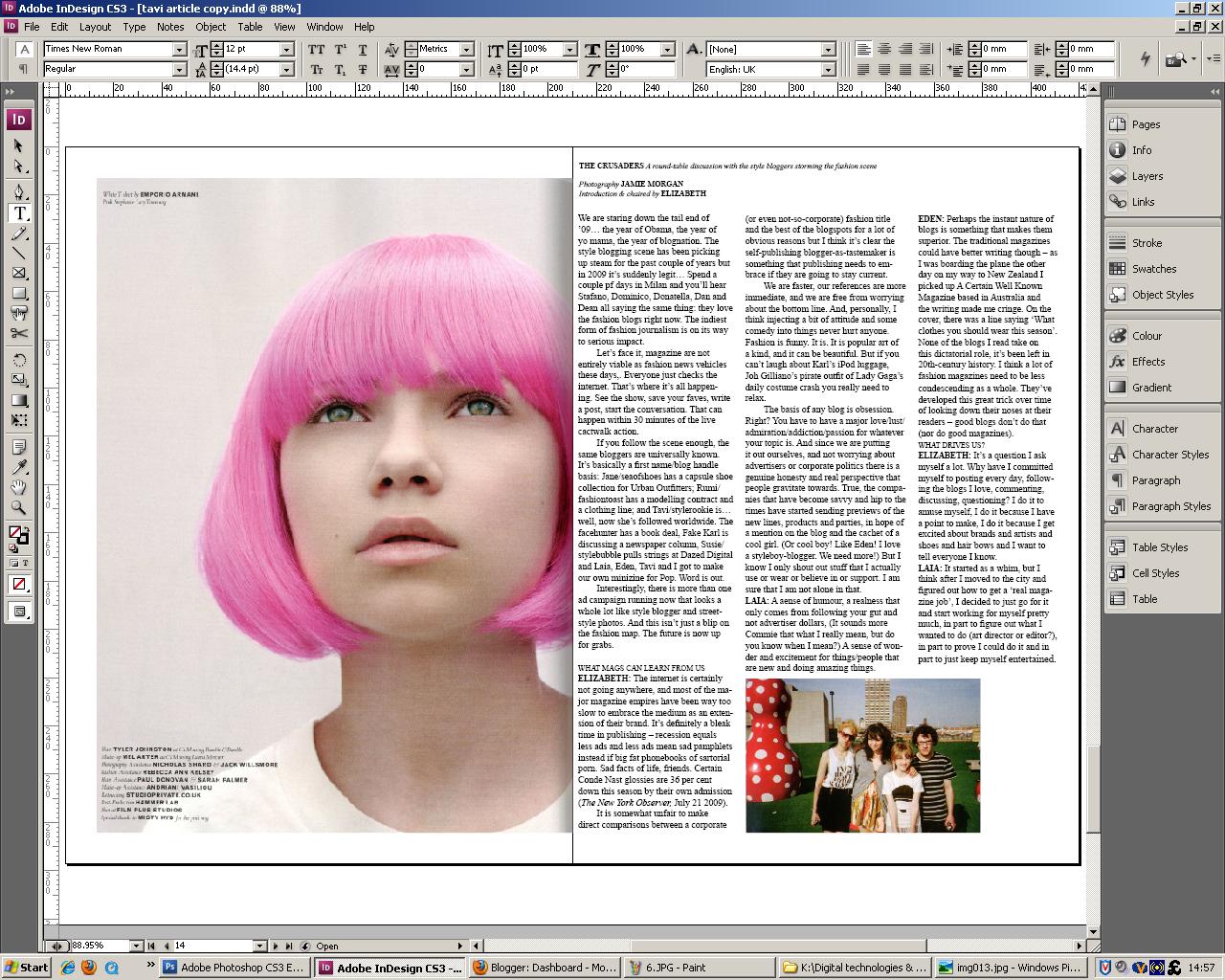
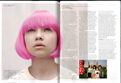
I felt that the article needed a page of text in order to make it feel like a magazine article and not just spaced out text. I think the image on the left complimented the double page spread and the page of text to the right of the image.

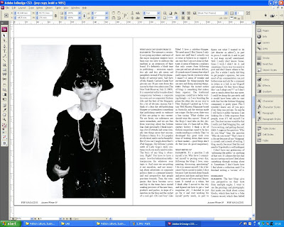
I have again integrated an image with the text on this double page spread. I like the right-hand-side page. I think the compositon of the page is interesting with the smaller cropped image in the bottom right corner of the page and the text looks 'effortlessley' placed on the corner of the image and on the plain white background. I felt this added to the overall design and layout of the article as the article has followed a neat expected layout, and i felt this was unexpected and drew attention.

The final page of the article is simple, with a photograph of Tavi and the blog listings in the top right hand corner of the page. In the original version of the article, the blog listings followed directy on from the txt, but i felt that placing the blogs on a new page by themselves makes them more noticeable to the readers.

Sunday 13 December 2009

Reconstructed article ideas


Project 1b:

On adobe indesign, i started to experiment with different ideas and layouts for my reconstructed article.


Edited Images: no text

These are my final images that i am going to work with on adobe indesign for my reconstruction if the article. I removed the text using the clone stamp tool on photoshop, carefuly covering and blending in the tones and colours from the background colour to neatly cover over the text. These are the images.


Wednesday 18 November 2009

Editing images on photoshop

After studying Photography at A-level, I am familiar with using Adobe Photoshop to manipulate and edit images. I decided to use this program to edit the original images from the magazine article in order to make them neater and of a better crop and composition.


This is the scanned in double page spead from POP magazine. On photoshop, i cropped the image in order to use it for my article replica.


Even though i have croppped the image, you can still see the shading of the curved page from when i scanned the image in.
So, in order to make the image look neater and not like it had been scanned in, on photoshop, i cropped my image further by about just under one inch. I did this not only to make my image look neater, but i also prefer the composition of the cropped image.


This was the result of the image i cropped. I prefer the composition of this image compared to the original. I like the simplicity of it and i think it is more eyecatching as the bright colours of the pom-poms on her jumper stand out alot more because the composition has become more simple.


The original images that I scanned in from the article contained text, so I wanted to remove this text so I was left with simple images to use in my version of the article.
To remove the text from the images, I used the clone tool to carefully clone and match the background colours in order to cover up the text. This process took some time in order to match the colours accurately.


Final replica of article

Project 1a


This are screen shots of my final copy of my article relica. I have tried to copy the layout of the article as accurately as I possibly could. I am happy with my copy, I think that it is an extremely similar representation of the original.

Tuesday 17 November 2009

Article replica

Project One:
Magazine Feature Article
Represented & Individualised

Project Focus:
Select a feature article from any Fashion &/or Design Culture magazine that personally inspires and interests you.

Project Aims:
The feature article you have selected must be considered, and reproduced in 2 distinct ways:
1. Representative: reproduced accurately, exactly and identically.
2. Individualised: re-structured, re-styled and re-presented.

Project Information:
Plan and develop the layout, exactly copy out the full text in MS Office Word, scan all the images in Adobe Photoshop. The layout of the 2 feature articles should both recreate exactly and adapt and enhance the copy/story provided. The completed article will be printed to exact scale.

The software you are expected to use to complete this project is:
Adobe Photoshop and Adobe In Design


Project 1a:
Own identical copy of original article

In order to get used to the programme Adobe Indesign, I produced a replica my chosen article in POP magazine.Firstly, I typed out the entire article in Microsof
t Word, and scanned in all the images at 300 dpi. I then edited and cropped these images in Adobe Photoshop to make them into separate images that I would be able to place into Indesign isolating them from the double page spreads that I scanned in. I pa
sted the text that I had typed up in Microsoft word into text box columns in Indesign, attempting to keep an almost accurate layout to that of the original article.


This is the opening double page spread copy that I have reproduced in Adobe Indesign.


In photoshop, I crop the double page scanned image into a single image that can be placed directly in my replica article in Indesign. With some of the images that I scanned in, I had to crop and rotate the arbitrary angle of the image (usually just 1 or 2 degrees) to straighten the image if it was scanned in at a slight angle.


These are some of the double page spreads that I have attempted to replicate from the article.


This page is an example of text placing into columns. I used the gridded guide lines in order to make the columns equal and neat.


For this double page spread, I was unable to copy the original page spread accurately as with the original, the text has been placed and layered directly over 1/3 of the original photograph. As I have not got the original image and only a scan of the page, my text on the right-hand page is instead presented on a white background.

(original copy)