Project One:
Magazine Feature Article
Represented & Individualised
Magazine Feature Article
Represented & Individualised
Project Focus:
Select a feature article from any Fashion &/or Design Culture magazine that personally inspires and interests you.
Select a feature article from any Fashion &/or Design Culture magazine that personally inspires and interests you.
The feature article you have selected must be considered, and reproduced in 2 distinct ways:
1. Representative: reproduced accurately, exactly and identically.
2. Individualised: re-structured, re-styled and re-presented.
Plan and develop the layout, exactly copy out the full text in MS Office Word, scan all the images in Adobe Photoshop. The layout of the 2 feature articles should both recreate exactly and adapt and enhance the copy/story provided. The completed article will be printed to exact scale.
The software you are expected to use to complete this project is:
Adobe Photoshop and Adobe In Design
Project 1a:
Own identical copy of original article
Own identical copy of original article
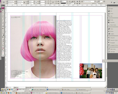
In order to get used to the programme Adobe Indesign, I produced a replica my chosen article in POP magazine.Firstly, I typed out the entire article in Microsof
t Word, and scanned in all the images at 300 dpi. I then edited and cropped these images in Adobe Photoshop to make them into separate images that I would be able to place into Indesign isolating them from the double page spreads that I scanned in. I pa
sted the text that I had typed up in Microsoft word into text box columns in Indesign, attempting to keep an almost accurate layout to that of the original article.

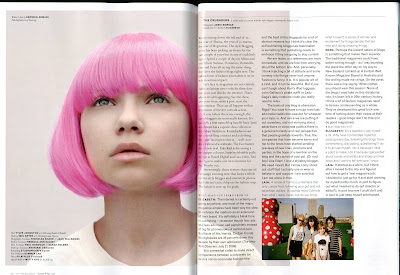
This is the opening double page spread copy that I have reproduced in Adobe Indesign.

In photoshop, I crop the double page scanned image into a single image that can be placed directly in my replica article in Indesign. With some of the images that I scanned in, I had to crop and rotate the arbitrary angle of the image (usually just 1 or 2 degrees) to straighten the image if it was scanned in at a slight angle.


These are some of the double page spreads that I have attempted to replicate from the article.

This page is an example of text placing into columns. I used the gridded guide lines in order to make the columns equal and neat.

For this double page spread, I was unable to copy the original page spread accurately as with the original, the text has been placed and layered directly over 1/3 of the original photograph. As I have not got the original image and only a scan of the page, my text on the right-hand page is instead presented on a white background.
 (original copy)
No comments:
Post a Comment